
You see dozens of logos every day on your phone, on packaging, in the street. Some stick in your memory after just one exposure. Others disappear immediately. The difference rarely lies in the budget invested: it comes from decisions made very early in the creation process, long before opening a graphic design software.
Logo creation brief: the invisible work that changes everything
Before choosing a color or a font, you need to put words to what the logo should convey. A solid brief answers three simple questions: who are you talking to, what distinguishes you from your direct competitors, and on what media will the logo be used daily?
A restaurateur selling takeout food and a law firm do not have the same constraints. The former needs a symbol that is readable in small format on a mobile app. The latter must work on letterhead and official documents. The brief determines the form as much as the message.
Take ten minutes to list your three most visible competitors. Place their logos side by side. You will quickly spot the dominant graphic codes in your sector, and you will know whether it is better to conform to them or to distance yourself. Platforms like maisonlogo.fr allow you to compare styles and clarify your expectations before starting the design.
Choosing colors and typography for a professional logo
Why do some logos seem immediately credible while others look amateurish? The answer often lies in two elements: the color palette and typography.
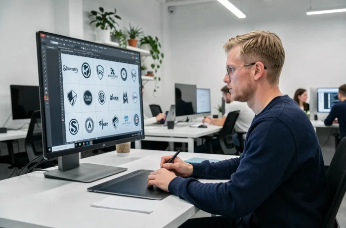
A common mistake is to multiply colors. Two main shades are sufficient in most cases. Add a third only if it plays a specific role, for example, to distinguish a sub-service. Each additional color makes the logo harder to reproduce in monochrome, which becomes problematic when printing a stamp or engraving a plaque.
In terms of typography, readability takes precedence over originality. A sans-serif font remains clear at all sizes, including as a favicon on a browser tab. If you choose a serif font, test it in a very small version before finalizing.
Quick readability test
Display your logo at the size of a social media thumbnail. If the text becomes unreadable or the symbol loses its shape, the design needs to be simplified. This test takes thirty seconds and avoids costly corrections after launch.
Logo variations: plan a system, not just a single image
A unique logo is no longer enough. Media have multiplied: profile photo on social networks, email signature, packaging, video, textile printing. Plan at least four versions from the outset:
- A main horizontal version, which will appear on your website and documents
- A square or round icon, suitable for avatars and favicons
- A monochrome version (black on light background, white on dark background) for situations where color is not available
- A vector file (SVG or AI format) that allows resizing the logo without loss of quality, from a billboard to a business card
If your designer or creation tool does not provide you with these four variations, you will have to produce them later, often in a rush. Integrating the variations into the initial deliverable avoids extra costs.
Copyright and trademark registration: protect your logo in France
Have you noticed that one logo sometimes looks very similar to another? Beyond the image problem, this is a real legal risk. In France, copyright arises from creation, but the designer’s rights must be transferred in writing for the company to exploit them on the intended media. Paying the invoice does not automatically transfer intellectual property.
To secure your visual identity, two precautions are necessary:
- Include a rights transfer clause in the creation contract, specifying the authorized uses (web, print, video) and duration
- Conduct a similarity search with the INPI before registering your logo as a trademark. The free search only covers strictly identical trademarks; only the similarity search detects visually or phonetically close signs
AI-generated logo
Logo generators using AI produce visuals quickly, but two distinct legal questions arise. First, the commercial license granted by the platform allows the use of the visual. Second, copyright protection of the result is not guaranteed by this license alone. If you start with an AI-generated logo, document precisely the edits and human creative choices you make.
Digital accessibility and technical integration of the logo
A well-designed logo can cause problems if it is poorly integrated into your site. Accessibility recommendations (WCAG) also apply to logos. When the logo contains text, that text must remain readable with sufficient contrast against the background. If the logo is purely decorative and the company name is already present in the HTML code, an empty alt attribute is acceptable.
However, if the logo serves as a link to the homepage, the alt attribute must describe its function (“Home – company name”), not its appearance. This technical detail improves the experience for screen reader users and contributes to natural referencing.
An impactful logo relies on a clear brief, measured graphic choices, a well-thought-out system of variations from the start, and appropriate legal protection. Creation tools have made design accessible, but it is the rigor of the upstream steps that distinguishes a lasting logo from a disposable visual.